Causal Diagram conspiracy theory
After years of hearing about, laughing at, being shocked by, and feeling frightened by various conspiracy theories, it is time to come out and declare my own 😊
Here it is: All methods, concepts, and tools practiced within the continuous improvement world under different names and acronyms (Six Sigma/DMAIC, Lean, QFD, RCA, PDCA, DOE, FMEA, …) are just shadows of something that truly rules this world: Causal Diagrams!
Let me explain:
What are Causal Diagrams?
I came across them for the first time around 2022, while reading “The Book of Why” by Judea Pearl. I fell in love with the concept immediately (even though I couldn’t fully understand it) and became a “firm believer” over the years.
What are they? Well, there are different layers of explanations (as in any good conspiracy theory 😉)
First, they may be understood as simple, pen-and-paper sketches showing cause-and-effect relations (known, hypothesized, or assumed).
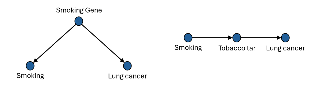
Let’s take this one as an example, taken almost directly from the book mentioned above, which can be used to illustrate the heated discussions from the 1950s around the harmful effects of smoking:
Second, they can be treated as an example of a formal mathematical structure: Directed Acyclic Graphs, or DAGs. A structure that has fixed terminology, common notation, and software to support it (check out very nice DAGitty tool).
Third, causal diagrams have a strong role in professional statistics and the broader science of proving the efficiency of treatment X on outcome Y (especially in medical sciences, social studies, agricultural analysis, etc.). Again, with formal terminology and rules behind (collider, fork, etc.)
Fourth, causal diagrams are increasingly discussed in AI world to “anchor” models in physical-world reality, based on explicit cause-and-effect relations rather than correlations spotted in the data.
In this article, I will stay on those initial, basic layers.
If you are more interested in those “deeper layers,” here are the people I follow on LinkedIn to get some insights, even if the content they share is sometimes so advanced that I usually understand only a fraction of it ;-): Piotr Nowicki, and Aleksander Molak with his Causal Bandits Podcast
Causal Diagrams in the Continuous Improvement
What does all of this have to do with Continuous Improvement/DMAIC/Six Sigma/Lean?
Well, the whole essence of continuous improvement is to keep improving the processes we are interested in (a manufacturing process, a patient registration process, a goods shipping process, a marketing process, you name it). Improving means changing a process from a state that we don’t really like to another, preferable state. And if we want to make the right change – a change that goes in the right direction, at the right scale, and stays over time – it is inevitable that we need to understand how the process works before we start playing with it.
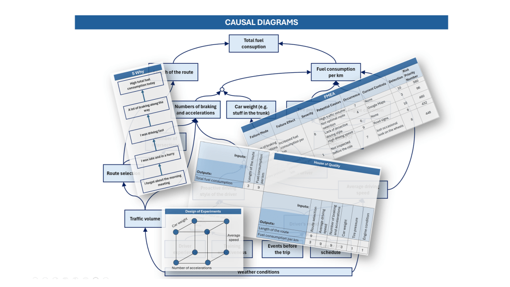
Let’s look at an everyday example. We drive to work by car and are interested in saving some money by reducing energy consumption per ride (fuel or electricity). Let’s understand this process first, before improving it. What are the factors influencing energy consumption per ride?
Here is my attempt to map them, using a simple pen-and-paper (or box-and-arrow-in-Excel) causal diagram:
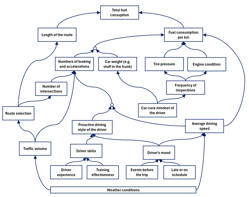
Is it a full and complete picture of this process? Certainly not. We can expand and detail it much more, but for the business goal in front of us, this should be enough.
Causal Diagrams behind different CI tools and methods
Let’s look at different CI tools that are benefiting from the causal diagram concept.
5 Why
If someone would like to apply 5 Why to dig into the root cause of the problem of higher-than-usual consumption on the ride on Monday, here is how it may look:
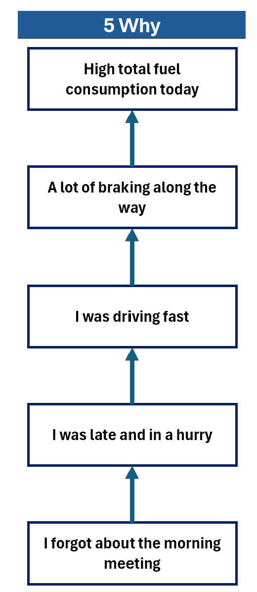
In essence, this is just following a single specific path in the underlying process causal tree, even if it’s never mapped or even thought about.
Cause Tree Analysis (or Fault Tree Analysis)
The same problem may be handled differently using Cause Tree Analysis, which is, in fact, a direct implementation of the causal diagrams in the world of Root Cause Analysis.
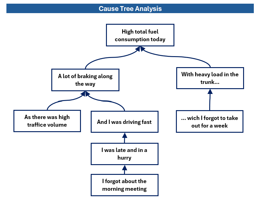
The difference is that it is created “ad hoc” when a specific problem needs to be analyzed and solved. If another problem (even a similar one) arises later, the CTA will most likely be recreated from scratch.
As soon as the proper process knowledge is present among the team analyzing the problem, it is not an issue. However, this is not always the case.
My recommendation (dream?) would be to create, document, share, and continuously use process causal diagrams for key processes, allowing all who work with the process to learn from them, apply them in problem-solving and improvement activities, and continuously enhance them.
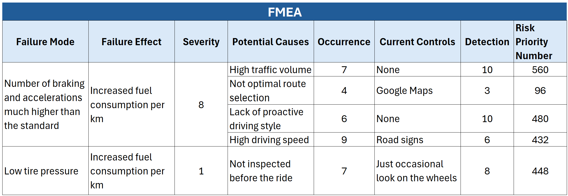
FMEA
FMEA is widely used in many situations, mostly to evaluate risks in processes: what may go wrong, why, and how likely it is.
Again, despite a totally different “look and feel,” it is rooted in the underlying causal relation of the process being studied.
Here is what FMEA may look like when used to analyze potential problems with fuel consumption in the process of driving to work:
Quality Function Deployment (House of Quality)
House of Quality is another “direct child” of causal diagrams, yet presented in a very different form.
The concept is no longer very widely used (at least in my area), which is a pity, as I consider it a very powerful tool for documenting process knowledge (check out my previous article about it).
Here is how it may look for our case:
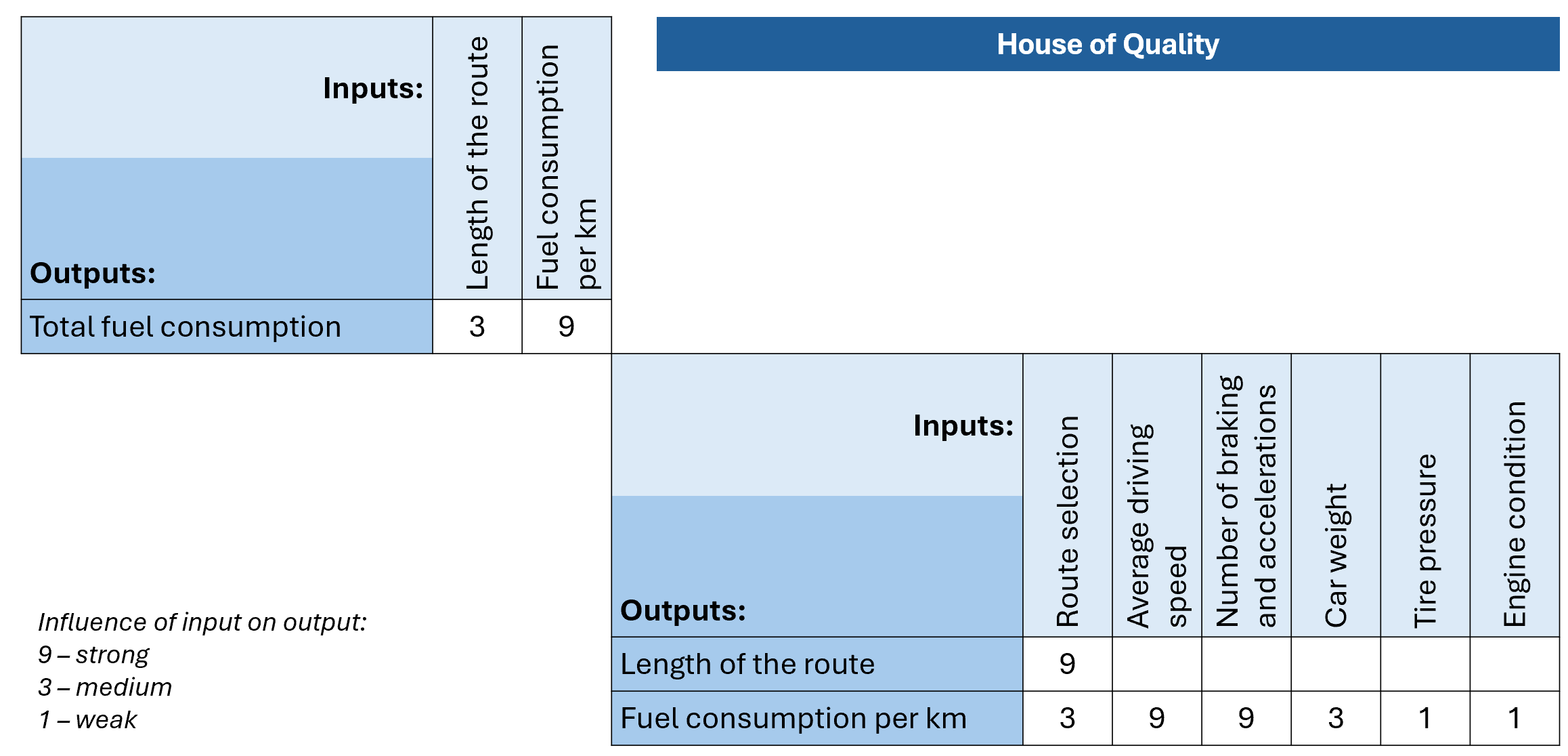
It is worth mentioning that I am referring here not to the “initial house,” which is kind of an icon of the Quality Function Deployment method, but rather to the “lower-level houses” that aim to decompose higher-level requirements into details of process parameters, controls, raw materials, etc.
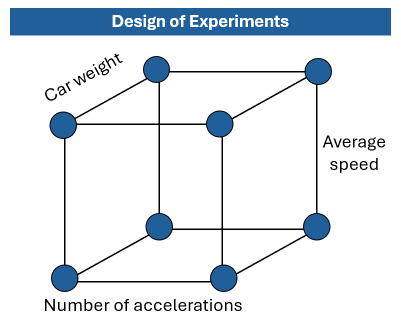
Design of Experiments
Finally, the concept that, in my opinion, cannot live without Causal Diagrams. Diagrams that are explicitly written down or implicitly assumed. Especially at the planning stage, when we need to decide which factors to include as inputs, which to fix, and which to treat as covariates.
In my area, decisions in this regard are made following experts’ discussions before the DoE, but I believe it would be much more powerful if they were based on the causal diagram of the process being experimented on.
Conclusions
What do you think now? Do you see the light of Causal Diagrams?! (speaking in the words of James Brown to the brothers Jake and Elwood Blues 😊)
I do believe that following this concept – in the form of pen-and-paper sketches or Excel with simple circles and arrows – can significantly improve our work in the Process Improvement domain.
Either as educators, helping others understand the essence behind some tools, or as practitioners, being more effective in improving our processes to the next level.
Happy Causal Diagramming!

Leave a comment