This article is a follow-up to the previous one about process knowledge and a result of several discussions on LinkedIn
It is a proposal of the standard way to visualize graphically mathematical equations, especially those obtained as a result of regression modeling.
Purpose
Provide a tool that can be used by manufacturing engineers and technologists, especially those working on complex manufacturing lines, to visualize and document knowledge about the process they are designing, qualifying, or improving.
For example, to better conceptualize/remember the behaviour of the process. Or as a way to explain/educate others, less familiar with it. Or as input for discussion with other process experts, also before any statistical study.
The concept is based on Structural Equation Modelling1 (SEM); however, only basic notation rules are taken from there. The whole “mathematical engine” of SEM is out of scope here.
Symbols to be used in the notation
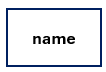
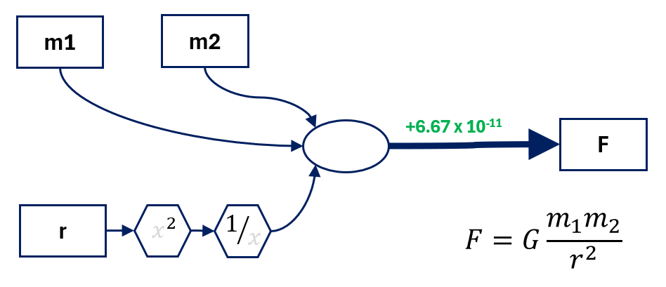
Observed, measured variable. Can be both input to or output from the process.
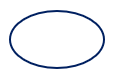
Latent, hidden variable that can’t be measured. Also, interaction between input variables.

Cause and effect relation. Width represents the strength of the relations (the higher the coefficient, the thicker the arrow). Three predefined thicknesses are available: for the highest coefficient, for the second highest, and for all the rest.
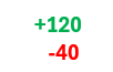
Values of the coefficients (positive in green, negative in red). Values in uncoded units, using actual, physical units used for the study.
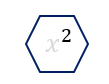
Operator, in most cases only square terms. But I can envision using all possible ones here, as needed.
Steps to visualise the equation
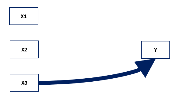
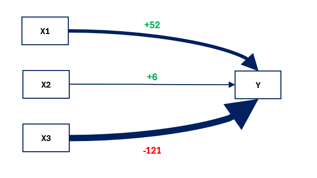
Imagine that you have just performed a study (for example designed experiment) and discovered the relation between three key process inputs (X1, X2, and X3) and the process output (Y) you are interested in. Let’s say this relation is in form of:
Regression Equation
Y = -81.3 + 52.41 X1 + 6.16 X2 - 121.54 X3
#1 Indicate all inputs and output as observed variables
#2 Identify the factor with the biggest coefficient (X3) and draw a thickest path to Y
#3 Identify the second biggest coefficient (X1) and draw a medium path to Y
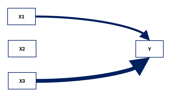
#4 Draw the path from remaining factor (X2) to the Y
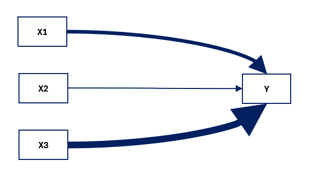
#5 Indicate coefficient values along the paths, with proper colour coding
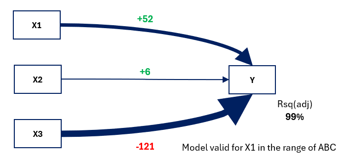
#6 Add any other relevant info to the graph (regression parameters, range in which the model is valid, the most frequent problems with some inputs, etc.
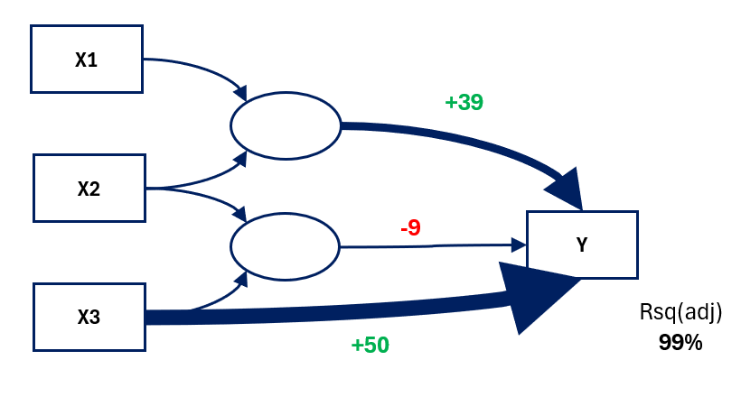
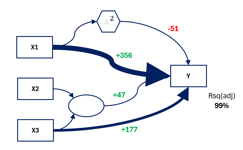
Examples
Regression Equation
Y = 210 + 50.7 X3 + 39.258 X1*X2 - 9.334 X2*X3
Regression Equation
Y = -1284 + 356.1 X1 + 177.4 X3 - 51.41 X1*X1 + 47.94 X2*X3
And the last one: imagine your name is Isaac, you have just discovered universal law of gravitation and would like to present it differently:
TinySEM Tool
All the graphs presented above have been created using TinySEM tool – super simple Excel file that I have developed to ease and standardize the work. All you need is to pick the visual needed, copy and past into desired place.
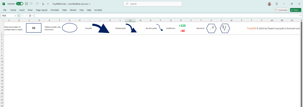
You can download the file below (it is plain Excel, no macros inside), give it a try and let me know what do you think!
- Here is some introduction info about SEM that I have used in this work: https://discoveringstatistics.com/repository/sem.pdf and Introduction to Structural Equation Modeling (SEM) in R with lavaan ↩︎


Leave a comment