Following our discussion about process stability in Part 1 of this article, let’s get into process capability. Again, staying on the general but practical ground and focusing on the purpose, not “mathematical mechanics.”
But before going into the details, it would be worth reviewing some background concepts first.
Fundamental idea behind Process Capability Study
This is about Taguchi loss function, a crucial concept that customers perceive ANY deviation from the requested product characteristic as a quality loss, causing a gradual increase of dissatisfaction with every step away from the target:
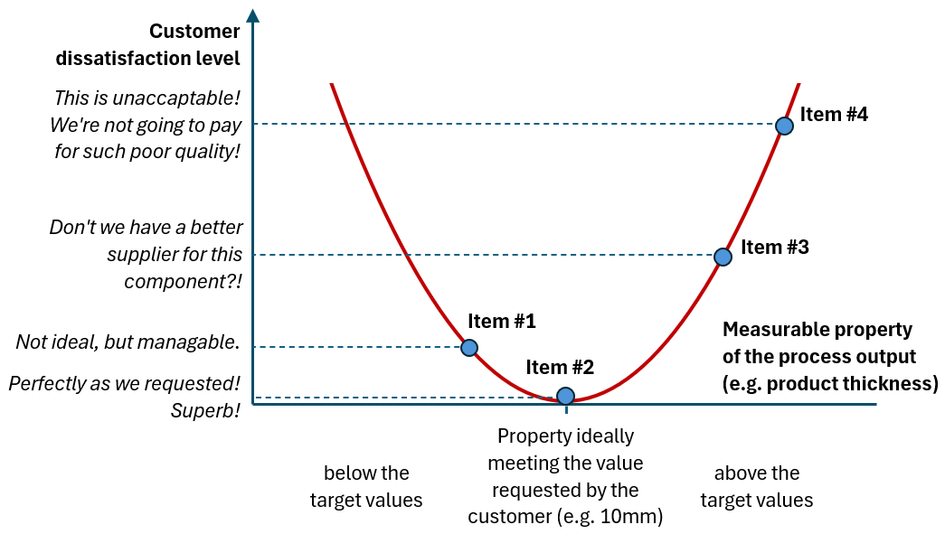
It is in stark contrast to the concept that “everything within spec is equally good and everything beyond the spec is equally bad,” and it sets the stage for continuous process improvement efforts: every reduction in deviation from the target will pay off in higher customer satisfaction.
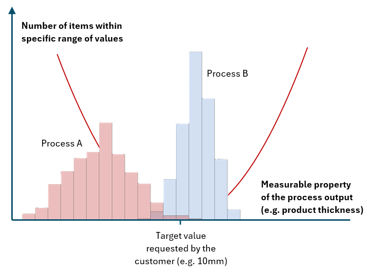
With Taguchi’s loss function in mind, we can now assess any process in terms of its “closeness” to the target. For example, Process B below seems to be better than Process A, as more items are produced around the target value, and the number of out-of-target items is dropping fast with the distance from the target. On the contrary, Process A is much more off the target, with many items produced below the target value.
Single score assessment
Such a descriptive assessment of the process would not really work. We need something more tangible.
- First, we need some ‘hard numbers’ to judge process capability, for example, those connected with the process spread (like standard deviation) and those connected with the bias or ‘offset’ from the target (like the difference between the process mean and the target).
- Secondly, we would like those numbers to be easy to interpret (“Are we in good shape or not?”) no matter what the property under study is and what units of measure are used (thickness in millimeters? weight in tons? viscosity in pascal*second?).
- Lastly, having just a single score, not two, would be great.
The result: Process Capability Index!
It’s a single number calculated from the process spread and bias numbers and normalized versus specification width (that should not matter anymore according to the Taguchi loss function concept, but we are using it here to get rid of the units of measure and simplify the whole story).

Leaving actual calculations aside, the Process Capability Index answers the question: How well does the process fit into specification width? How much “space” do we still have between the process and the specification limits?
The more “space” (i.e., the lower the spread and the bias), the higher the index.
Index has no unit, can take any numerical value, and should be interpreted as below:
- Value of 1 is a borderline: process barely fits into the specification (either because process spread fills the whole specification width, or there is a bias pushing one side of the process very close to the specification limit)
- Values below 1 mean that the process does not fit into the spec.
- Values above 1 mean that there is a space between the process spread and the spec; value 1.33 is commonly perceived as “good enough to be at.”
Several Process Capability Indices (and the one to rule them all)
Unfortunately, the story of simplification and getting into a single score ends here, to my great disappointment. I do believe that the single Process Capability Index (as described above) would be enough. But for whatever reasons – several versions have been created and are in practice ☹ They share the same interpretation (the higher, the better; the value of 1 is borderline) but are using slightly different calculation methods.
Let me summarize those differences in the table below for the most commonly used ones: Cp, Cpk, Pp, and Ppk.

The one and only indicator that we should be using is Ppk. It perfectly answers the question that is the purpose of the Process Capability study (as I stated in Part 1 of this article): “Are we delivering results within the agreed limits? How well within?”
If Ppk=1, we do deliver results within the agreed limits, but barely.
For Ppk = 1.2, we are doing it much better.
For Ppk = 2, we are in the “world-class” category.
All other indicators neglect part of the story, showing rather “potential capability” than the actual state of the process.
For example, Cp and Cpk indicators neglect special cause type of variability, limiting process spread to the common case part only. As a result, they rather say that the process would be on this quality level if there were no special causes present in the process. This is also visible in the names of those indicators: Pp stands for process performance (in the meaning of the actual results), while Cp stands for process capability (in the meaning of the ability to achieve something potentially).
Of course, as indicated in Part 1 of this article, we should aim to stabilize our processes (so make them special causes free). But let’s have two separate discussions – the first to judge process stability using control charts and the second to assess process alignment with requirements using the Ppk index.
Similarly, Cp and Pp indicators neglect the process’s actual bias. They assume the process is perfectly centred within the spec, regardless of the true picture. Again, they are more to indicate “potential” than actual process performance.
If I had to recommend a second indicator on top of “the one and only” Ppk – I would pick Cp. Looking at those two we can see what is current, the actual performance of our process (Ppk), and what level we can potentially achieve if we manage to stabilize the process fully and to entirely center it in the middle of the spec (Cp)
Are you using Cpk heavily in your Process Capability studies? Consider changing it to Ppk!
Example
Let’s return to the process example that was the subject of our Process Stability Study in part 1 of this article and assume that the requirement is to complete between 100 and 260 items per day.
Are we delivering results within agreed limits? How well within?
Let’s bring back the control chart we have reviewed in part 1 of the article:

The green shaded area represents specification width (100-260) and is marked here just for illustration purposes. It is not recommended to add specifications to the control charts.
Looks like process spread is slightly wider than the specification so we should expect capability score slightly below 1.
Picture below presents them all, together with the typical visualization that you can find in many software packages offering such functionality:

How to interpret those results?
- Actual process performance is below expectations, at the level of Ppk=0.76
- We can improve it to the level of 0.94 if we move the process more to the centre of the spec, or by making it more stable.
- If we achieve both things, we will reach a level of 1.18.
- To increase the process further, for example, to the level of the commonly used goal of 1.33, more ‘fundamental’ process improvements are needed, to understand all sources of ‘natural’, common cause variation within the process, and work to reduce it.
Summary
I do believe that both concepts: Process Stability and Process Capability are very powerful in improving any process that can be measured with data. Of course, there are many nuances and details behind, conditions to be verified, different versions to be used in specific situations – but underlying ideas are always the same:
- All processes have two types of variation: common cause and special cause
- Any action to reduce variation pays off in the higher customer satisfaction
- Control Charts can help us to target our actions better
- We can measure their effectiveness by Capability Indices
I hope that both parts of the article can be valuable resources in your journey to more stable and capable processes. Good luck!
Related content:
- Using simple average as a complete capability index in a specific group of processes: Measuring process capability by …simple average?!
- What does it mean to have “process knowledge”? – Do we know how our processes work? Do we know how well we know it?

Leave a comment